Cover art... A progression.
The making of the art for "of Monsters & Magic"
Thea Allis
5/24/20242 min read
I am not a graphic designer.
No, really. I have zero talent and no idea what I am doing. Conveniently (or inconveniently) I also have an itty bitty budget. This is how the progression of cover art began.
With no real idea of what I wanted it to look like, and no clue how to create a cover for a book, I started messing around using a free digital design program to see what I could do. This was the result...

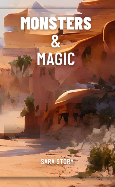

Needless to say, it wasn't great.
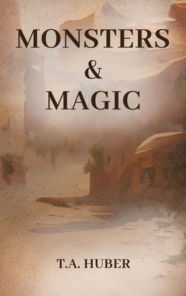
One thing I did like about it was the color. The story takes place mainly in a desert and I thought the colors made sense (even if the rest of the design didn't. Around this time, I learned about Canva, a free online program for graphic design. It had SO many options! I definitely spent more time than I should have messing around with all the different things I could do. Here are those results...
Still not great.
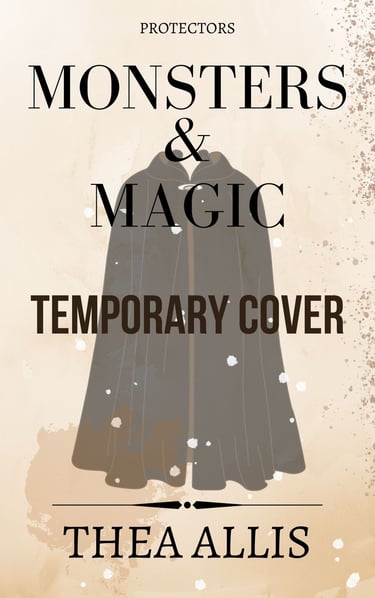
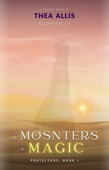
On I went to learn more. I searched through FB groups for indie authors and cover design groups, thinking it would be so much easier to just hire a cover designer. I found a couple designers whose work I loved and searched through their portfolios looking for elements that stood out to me and studying their designs. During this time I also figured out my genre (cozy fantasy). My stories are mainly character driven with internal conflict outweighing external conflict (not that there isn't any of that). This helped me narrow my search through book covers for ones that might better fit my genre. Here was what I came up with...
Getting closer, but still not quite right.
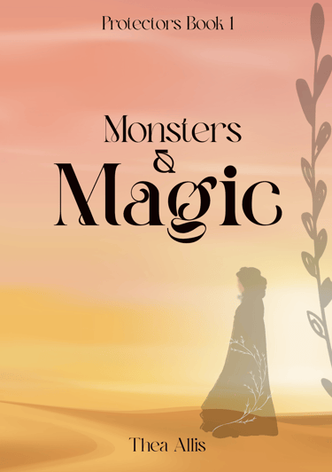
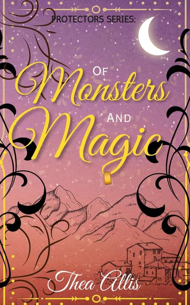
I was trying to imitate the fancy designs of very skilled graphic artists, and I was falling short in a major way. I had lost my favorite parts from previous covers. Also, my design was far too complicated and busy! So, it was back to the drawing board (or in this case, the computer). I headed to YouTube university for some informal training (that was clearly overdue) and did some image searches for covers of books in my genre. With a discounted membership on a creative graphics site, a free open source image manipulation program, and a free trial for Canva Pro, I came up with another design idea. This time, my mantra was "keep it simple" and "less is more". The result was the best cover design I have made so far...
It's not perfect, but I am proud of what I have accomplished. I still have so much to learn, but I have come a long way from where I started.
If you are in the same boat now, I want to encourage you. Don't give up! Have patience and remember, less is usually more.
Leave your thoughts, advice, or a note of encouragement in the comments!
Until next time,
Thea Allis